Monday, April 19, 2010

Contemporary Typography & Neville Brody

"Neville Brody" fig.1

Typography is an illustration technique used to create, design, arrange and modify type glyphs.Typography grew at the same time with printing developments and many discoveries and inventions.Later on, typography had different movements and styles in terms of design just like any other work of art. In 1990’s contemporary typography was identified mostly as a modern and sans serif typeface; on the other hand, at that time many designers thought that a lot of typefaces that were created through software’s lacked quality and style(Eskilson,2007,405). The first practical and useful yet famous typeface was Helvetica followed by a newer version, Arial as well as many others. Like any other art movement, contemporary typography had pioneers and great artists, such as Neville Brody(fig.1).

Neville Brody is an English Graphic designer, who was born in London in 1957. Brody is a graphic designer,art director, type designer and also studied painting in one of UK’s colleges (De Jong, Purvis, and Friedl, 2005, 281). His archive included various records and magazine covers. He also worked for brands such as Nike and Premier TV; In addition, he worked in different countries like Berlin, Tokyo, Hamburg ...etc. As mentioned above, Brody is considered one of the great type designers, he was mostly inspired by Art Deco when he used the aesthetic elements from it and betrayed the non-European influences (De Jong, Purvis, and Friedl, 2005, 281).Industria, Arcadia, Insignia, Blur, Pop, Gothic and Harlem are examples of typefaces Brody designed.
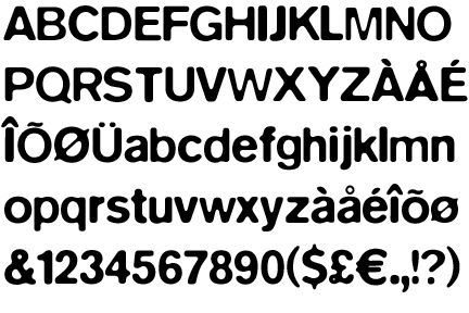

"Insignia" fig.2
Insignia(fig.2)was released on 1989 by linotype library. It was influenced by the Bauhaus new typography and it extracted its basic forms from the constructed Grotesque fonts. The characteristics of it such as: monoline and the round -and- sharp forms reflect the spirit of that period and implies technology and progress. Like other Brody fonts, it is recognizable as one of the trendy, cutting – edge classics of our computer era (De Jong, Purvis, and Friedl, 2005, 281). Insignia was used for the “Arena” magazine headlines.(fig.3).
"ARENA Magazine" fig.3
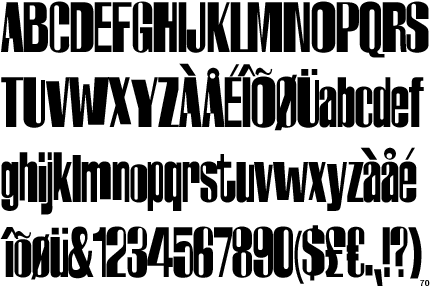
"Industria"fig.5

Another Typeface designed by Brody was “Industria”(fig.5).Brody created Industria for “The Face” magazine(Wozencraft,2001 ,101)(fig.6). The typeface was released on 1989;Industria had uniqueness and individuality when it is a sans serif type, that has a systemized mechanical structure of straight strokes and rounded corners with rectangular counter spaces (De Jong, Purvis, and Friedl, 2005, 281). The usage of the typeface was mostly in the subtitles of the magazine and in the inner content of it.

"The Face" fig.6

“Just Bounce It” or “Nike Poster”(fig.4) is a poster designed by Brody,which advertises for Nike as mentioned above. Brody used the typeface Helvetica in it, when he didn’t use much color but mostly black, white and red for the logo of Nike. The text used in the poster is rotated, enlarged, reduced and shifted in different ways which makes it slightly difficult to identify and read the text; yet, it is eye catching. The text included is derived from the Nike slogan such as “Just Bounce It”, “Just Zap It”, “Just Smash It”, “Just Slam It”, and “Just Do It”(Blackwell, 2004, 142).
"Just Bounce It" fig.4


In conclusion, at the time when typography lacked style and quality, a great artist rose and gave it a sharp and modern touch that still takes place until today. His famous Insignia, Industria and his different fonts are one of the typefaces that symbolized progressiveness, modernity and uniqueness. Nowadays, Neville Brody marks as one of the great, most unique and inspiring designers.


Bibliography:

•Eskilson, S. J. (2007).Graphic Design; A New History. North America, Connecticut: Yale University Press.

•De Jong, C.W., Purvis, A.W., & Friedl, F. (2005).Creative Type. New York: Thames & Hudson.

•Blackwell L. (2004). 20th- Century Type. North America, Connecticut: Yale University Press.

•Wozencroft, J. (2001). The Graphic Language of Neville Brody. USA: Universe Publishing.

•Latest Work of Neville Brody: http://www.researchstudios.com/

Monday, February 1, 2010

Jules Cheret and poster design in 19th century

"Jules Cheret" fig. 1


During the 19th century, many designers believed that there was a lack of beauty in the world that was built-up and fostered by the industrial revolution. They wanted to make the world a place of aesthetic accomplishment and to unify the different design arts including graphic design (Eskilson, 2007, 35). The designers also thought they could and should create new styles for the world they’re living in. Art Nouveau was a movement that was spread all over United Kingdom, United States & Europe. It had wide fields in arts and design, such as fashion, jewelry, architecture and design. In France, art nouveau was known and famous as the Guimard style according to the French artist Hector Guimard .Graphic design had it space during the art nouveau movement, specifically poster designing for commercial use. A lot of designers were influenced by Art Nouveau such as: Toulouse – Lautrec, Klimt, Beardsley, Cheret and many others. The movement at first was manipulated by the Czech artist Alphonse Mucha, he who produced a lithographic poster which was displayed in the streets of Paris.

The most influential poster designer for the late 19thcentury was Jules Cheret “The father of the modern poster”(fig.1). He was a French designer, painter and a lithographer who was born in Paris on 1836. Cheret had a limited education when he went to study in London at his youth age. He also was gifted since he supported and worked with the art of color lithography. After working severally with lithography, Cheret was convinced that this process will soon take over the letterpress printing (Eskilson, 2007, 35). The father of the modern poster was strongly influenced by the poster design; he created poster ads which promoted night clubs and theatre events. Cheret also invented the over – sized street poster when mostly all his posters were life – size ones (7 feet tall), used to be printed in two pieces and joined together on the wall.

Cheret’s took the French 18th century style “Rococo” and the Japanese wood block prints as the main influence for his posters. Starting with “Rococo”, Cheret concentrated his posters on uniquely French style when he also tried to show the national achievements of a society that was experiencing a wave of self-doubt and introspection (Eskilson, 2007, 35).Also, it is known that the Rococo subject matter depends on the playful sensuality. As mentioned, he was also influenced by the Japanese woodblock prints, when all his prints have a black outline filled with flat or graduated color with very little details and mostly the images were designed as simplified abstract shapes and silhouettes.

Unlike other artist who used to design on papers and translated work by a lithographer, Jules pioneered the technique of drawing and designing directly on stone( Kery, 1986, 53), when he first produced and developed three-stone lithographic prints. Most of Jules’ posters included red-haired women, or what he called “Cherettes”, which were always presented as happy, confident and self-assured who drinks and even smokes in public.

As mentioned, Cheret’s posters mostly had subjects that were familiar with the world of circus, cabaret and Paris theatre. Hundreds of posters produced by him advertised for performances which attracted the famous American dancer Loie Fuller, who asked him to design a poster for her performance in 1893 at the Folies Bergere, Paris.

Jules presented Loie Fuller spinning on the stage when her silk dress sparkling in a rainbow color, when he also showed the influence of the Rococo style in it(fig.2). Loie Fuller’s dances were abstract, which depended on the changing effects of colored spotlights projected on to her flowing, diaphanous costumes which she manipulated by long batons attached to the fabric (Timmers, 1998 ,32). Loei performed four dances at the Folies Bergere which are: “Serpent Dance, Violet Dance, White Dance and Butterfly Dance” that’s when Cheret created for her shows four other versions of his first poster but with different color combinations.


"Folies Bergere, Loie Fuller" fig. 2

Another poster by Cheret, which also advertised for a dance performance at the Folies Bergere, yet it showed the influence of the Ukiyo-e Japanese woodblock prints. “Les Girard” displayed planes of even color, contour lines, and two-dimensional characters of all the work(fig.3). This poster also showed a new aspect in graphic design, were Cheret merged image and text together. As known as, it is unnecessary to use pre-designed type in a chromolithography so Jules designed his own typeface by hand when he also minimized the usage of text in the poster to add a sense of joyfulness in its place.


"Les Girard" fig. 3


"Les Saxoleine" fig. 4


One of Cheret’s famous poster was “Les Saxoleine”, which was a lithographic poster added to “Les Maitre Des L’affiche”(Masters of the Poster) series. Jules not only designed posters to advertise for musical theatres and cabarets, but also for products. He created a wide collection for Saxoleine Paraffin or Lamp Oil (Schardt, 1970, 98). In figure 4, a very attractive lady is standing next to a lamp feeling pleased for having a bright light to enlighten the room when Cheret’s initial point was creating a homey atmosphere with warm tones of colors around the lamp. The product is not shown there in the poster, but Jules was convinced with his Beautiful and highly spirited model that women would aim for it (Gold, 1998, 20).


In conclusion, due to the Art Nouveau movement that took place in Europe and the United States, a revolution in art took place. One of the new artists that brought revolution to art is Jules Cheret, who’s the “father of the modern poster”. The influence of “Rococo” and Japanese wood block prints gave birth to his modern posters. Cheret introduced night life in Paris through his posters that promoted night clubs, cabarets, and theatres. He also presented beautiful, attractive Parisian women that are full of joy, happiness and hope. Jules wanted to deliver a message to the community that they are part of the society as well.

Gallery:


"AlCazar D'ete - Lidia"


"Papier a Cigarettes Job"


"Folies Bergere - Fleur De Lotus"


"Les Saxoleine"


Bibliography:
• Drucker, J., McVarish, E. (2009). Graphic design History: A critical Guide. USA: Pearson Prentice Hall.

• Eskilson, S. J. (2007). Graphic Design: A New History. North America: Yale University Press.

• Gold, L. (1998). First Ladies of the Poster: The gold collection. New York: Posters Please Inc.

• Kery, P. F. (1986). Art Deco Graphics. United Kingdom: Thames & Hudson Ltd.

• Schardt, H. (1970). Paris 1900. New York: G.P. Putman’s Sons

• Timmers, M. (1998). THE POWER OF THE POSTER. London: V & A publications.

Poster history. (n.d.) Retrieved on January 17, 2010, from http://www.designhistory.org/posters.html

Jules Cheret. (n.d.) Retrieved on January 17, 2010, from http://en.wikipedia.org/wiki/Jules_Ch%C3%A9ret

Graphic Design History. (n.d.). Retrieved January 20, 2010, from http://gds.parkland.edu/gds/!lectures/history/1890/artnouveau.html

The Great Poster Movement. (n.d.) Retrieved January 22, 2010, from http://www.yaneff.com/html/history/history.html

The Great French Poster Tradition. (n.d.) Retrieved on February 1, 2010, from http://www.postershow.com/french_poster/poster_history.htm