 "Neville Brody" fig.1
Typography is an illustration technique used to create, design, arrange and modify type glyphs.Typography grew at the same time with printing developments and many discoveries and inventions.Later on, typography had different movements and styles in terms of design just like any other work of art. In 1990’s contemporary typography was identified mostly as a modern and sans serif typeface; on the other hand, at that time many designers thought that a lot of typefaces that were created through software’s lacked quality and style(Eskilson,2007,405). The first practical and useful yet famous typeface was Helvetica followed by a newer version, Arial as well as many others. Like any other art movement, contemporary typography had pioneers and great artists, such as Neville Brody(fig.1).
Neville Brody is an English Graphic designer, who was born in London in 1957. Brody is a graphic designer,art director, type designer and also studied painting in one of UK’s colleges (De Jong, Purvis, and Friedl, 2005, 281). His archive included various records and magazine covers. He also worked for brands such as Nike and Premier TV; In addition, he worked in different countries like Berlin, Tokyo, Hamburg ...etc. As mentioned above, Brody is considered one of the great type designers, he was mostly inspired by Art Deco when he used the aesthetic elements from it and betrayed the non-European influences (De Jong, Purvis, and Friedl, 2005, 281).Industria, Arcadia, Insignia, Blur, Pop, Gothic and Harlem are examples of typefaces Brody designed.

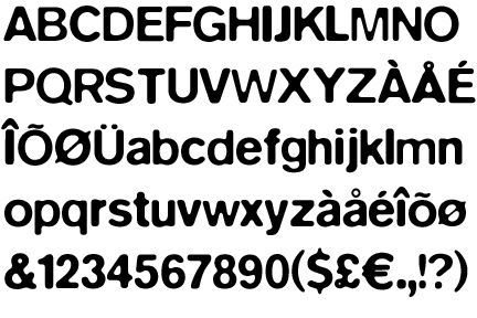
"Insignia" fig.2
Insignia(fig.2)was released on 1989 by linotype library. It was influenced by the Bauhaus new typography and it extracted its basic forms from the constructed Grotesque fonts. The characteristics of it such as: monoline and the round -and- sharp forms reflect the spirit of that period and implies technology and progress. Like other Brody fonts, it is recognizable as one of the trendy, cutting – edge classics of our computer era (De Jong, Purvis, and Friedl, 2005, 281). Insignia was used for the “Arena” magazine headlines.(fig.3).
 "ARENA Magazine" fig.3
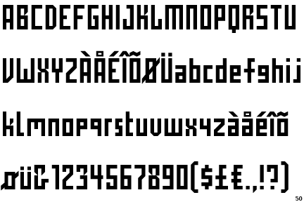
 "Industria"fig.5
Another Typeface designed by Brody was “Industria”(fig.5).Brody created Industria for “The Face” magazine(Wozencraft,2001 ,101)(fig.6). The typeface was released on 1989;Industria had uniqueness and individuality when it is a sans serif type, that has a systemized mechanical structure of straight strokes and rounded corners with rectangular counter spaces (De Jong, Purvis, and Friedl, 2005, 281). The usage of the typeface was mostly in the subtitles of the magazine and in the inner content of it.
 "The Face" fig.6
“Just Bounce It” or “Nike Poster”(fig.4) is a poster designed by Brody,which advertises for Nike as mentioned above. Brody used the typeface Helvetica in it, when he didn’t use much color but mostly black, white and red for the logo of Nike. The text used in the poster is rotated, enlarged, reduced and shifted in different ways which makes it slightly difficult to identify and read the text; yet, it is eye catching. The text included is derived from the Nike slogan such as “Just Bounce It”, “Just Zap It”, “Just Smash It”, “Just Slam It”, and “Just Do It”(Blackwell, 2004, 142).
 "Just Bounce It" fig.4
In conclusion, at the time when typography lacked style and quality, a great artist rose and gave it a sharp and modern touch that still takes place until today. His famous Insignia, Industria and his different fonts are one of the typefaces that symbolized progressiveness, modernity and uniqueness. Nowadays, Neville Brody marks as one of the great, most unique and inspiring designers.
Bibliography:
•Eskilson, S. J. (2007).Graphic Design; A New History. North America, Connecticut: Yale University Press.
•De Jong, C.W., Purvis, A.W., & Friedl, F. (2005).Creative Type. New York: Thames & Hudson.
•Blackwell L. (2004). 20th- Century Type. North America, Connecticut: Yale University Press.
•Wozencroft, J. (2001). The Graphic Language of Neville Brody. USA: Universe Publishing.
•Latest Work of Neville Brody: http://www.researchstudios.com/
It is good but there is no logical connection between the 1st and the 2nd part of the essay. Also within the first paragraph there are problems with the sequence.I think you should begin your essay with the 2nd paragraph, summarize the first one even more and concentrate on the comparison and description of Brody's typefaces.
ReplyDeletePlease, come and see me if you face difficulties.
"Insignia was the typeface that was used for the designed of the headline face of 'Arena' magazine" not "Insignia was designed as a headline face"
ReplyDeleteYou have given some very good examples. Can you please give more and make the introduction shorter?
Good job!
When you refer to Brody in your text please do this by his last name (not first name).
ReplyDeleteYou have done a very good research :-)
Look at his website for current projects related to typography (if he has any).
Create also a link to his website and try to find some videos related to with type design for your blog.
If you find a good conclusion, you are done.
It is important that you combine print with electronic sources. I think this is what is missing from your essay now.
ReplyDeleteFinal Remarks:
ReplyDeleteEskilson (2007), Beazley, (2001) and Wozencroft, (2001)are only on the bibliography and not as in-text references. You have to specify in the text how you used these publications.
Please print the text and come and see me on Monday before our class so that we talk about some language problems.
After you have improved the English and the in-text references I think the essay will be fine.
You've done really a very good job!!!!
ReplyDeleteDr Katerina told me about your blog on Neville Brody, I just checked it and I love it. Keep up with the good work. Bravo! - Nicos
ReplyDeletecsb
ReplyDeletehey katherina
ReplyDeleteam a student of graphic design final year. i am designing a typeface for my thesis, can yo take a look at my process work and give me your feedback about it so that i can improve my work.
it will be a great favor for me.
ok
Delete
ReplyDelete